• Travel app logo
CLIENT
Tripgenie
SERVICES
LOGO DESIGN
RE-BRANDING
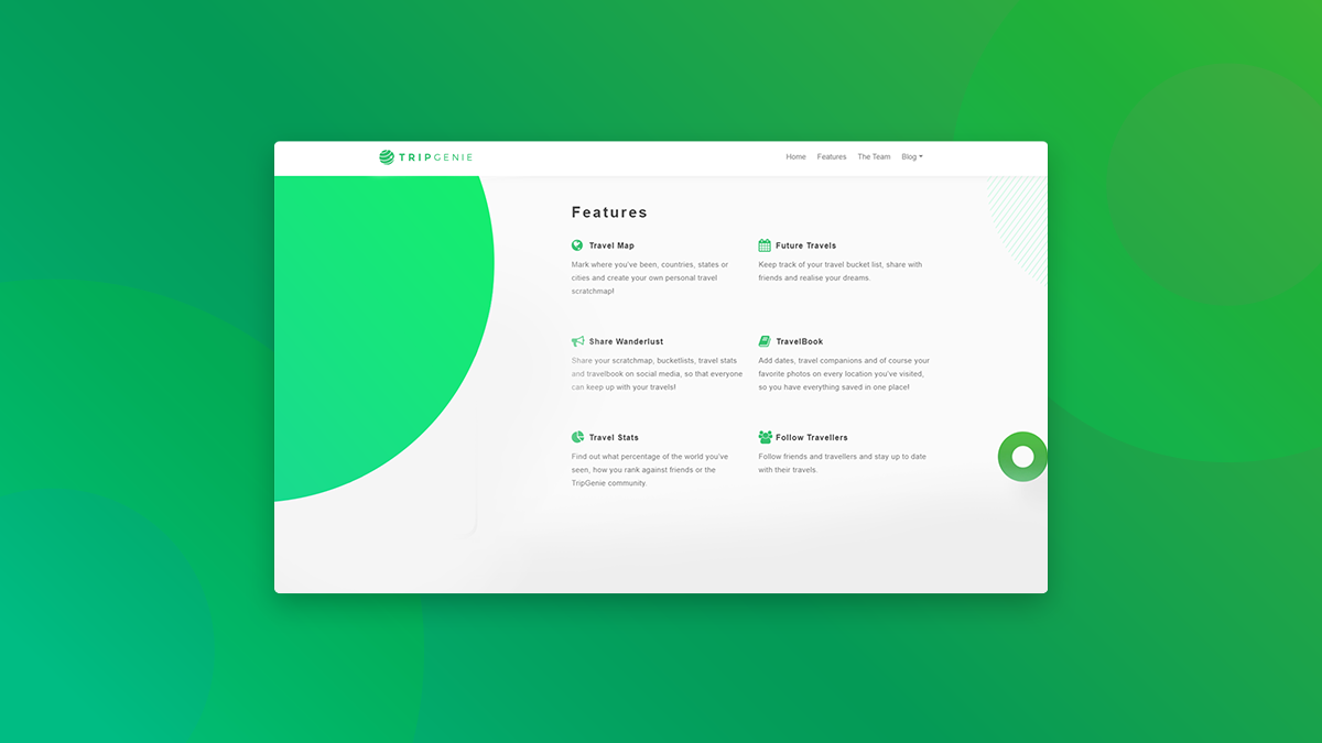
Tripgenie
Redesigning destination.


Pain Points with the Old Logo:
The design was too complex, making it difficult to read on smaller scales.
The icon was unbalanced, which made it hard to apply on social media platforms.
It featured sharp, edgy points and lacked a landscape version for versatility.
While the font choice was good, the typography didn’t ensure easy readability on all platforms.
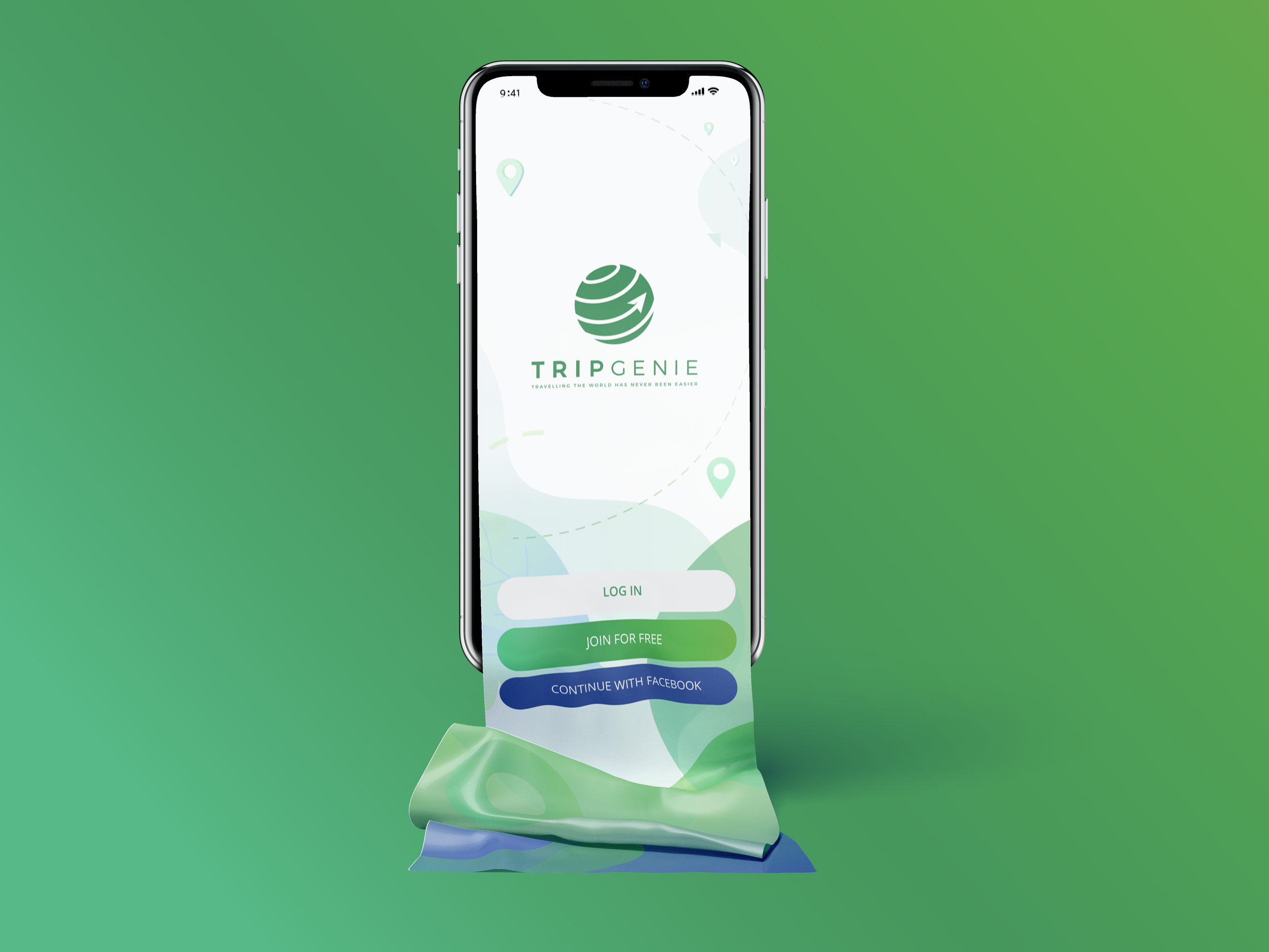
Solutions Implemented in the new Logo:
The new design is simplified and clean, ensuring it remains readable at all sizes.
We created a balanced circular icon, making it adaptable for social accounts and templates.
The logo now works well in both landscape and portrait orientations, enhancing its flexibility.
By maintaining the same typeface, we reduced the letter spacing to improve legibility on all platforms.