• Digital events’ system & campaign
CLIENT
Times Higher Education
SERVICES
EVENT BRANDING
VISUAL SYSTEM
DIGITAL CAMPAIGN
PRODUCT DESIGN
SOCIAL MEDIA
THE Student Festivals
A GenZ-targeted scalable system, that reimagines educational events for the next generation of learners.
As part of the Times Higher Education Group,
The Student Festivals is a global digital platform connecting students from over 100 countries through dynamic and engaging events. For this project, I collaborated closely with the Head of Design to develop a scalable and cohesive brand system, ensuring regional differentiation while maintaining a unified identity.
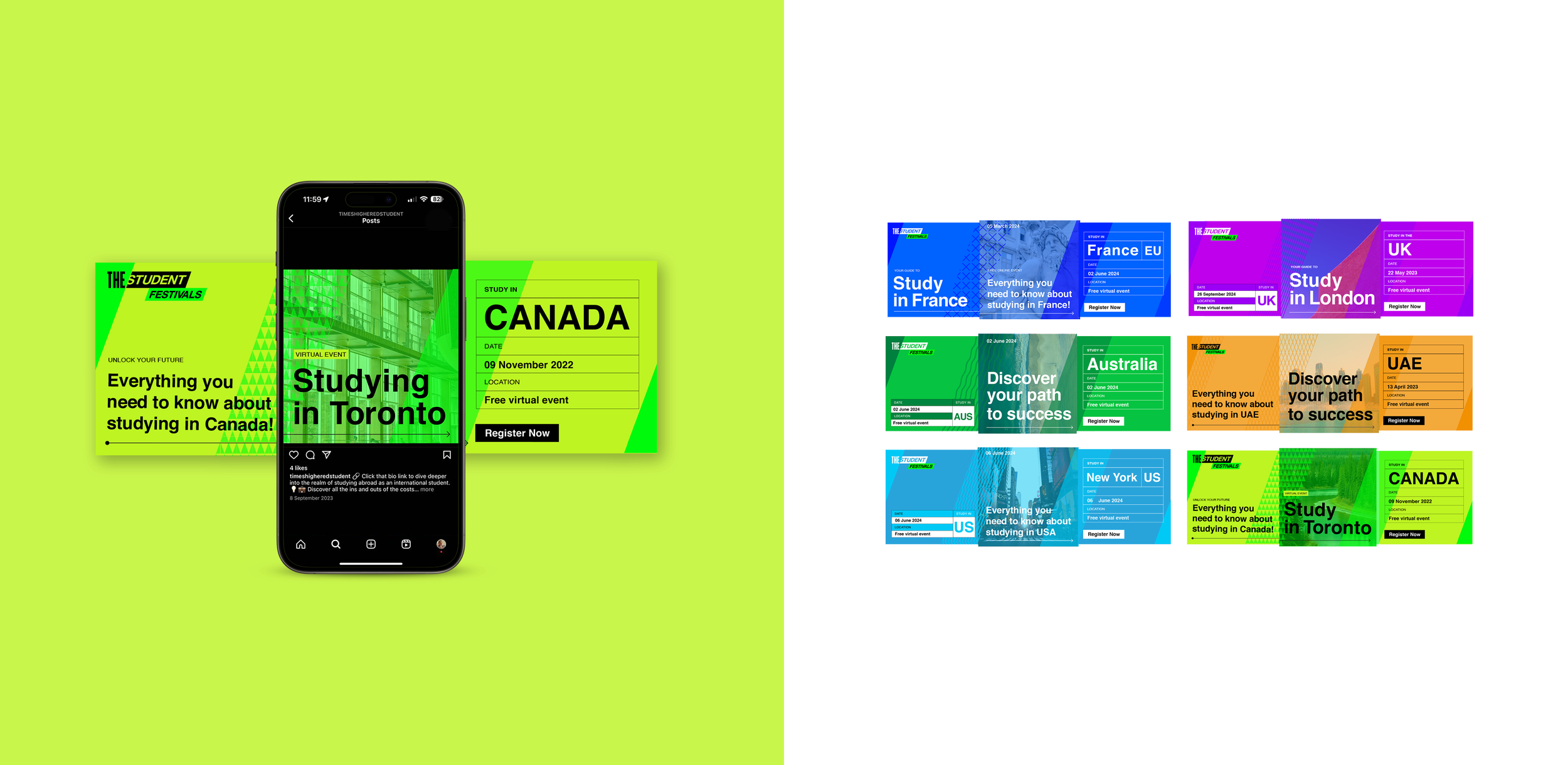
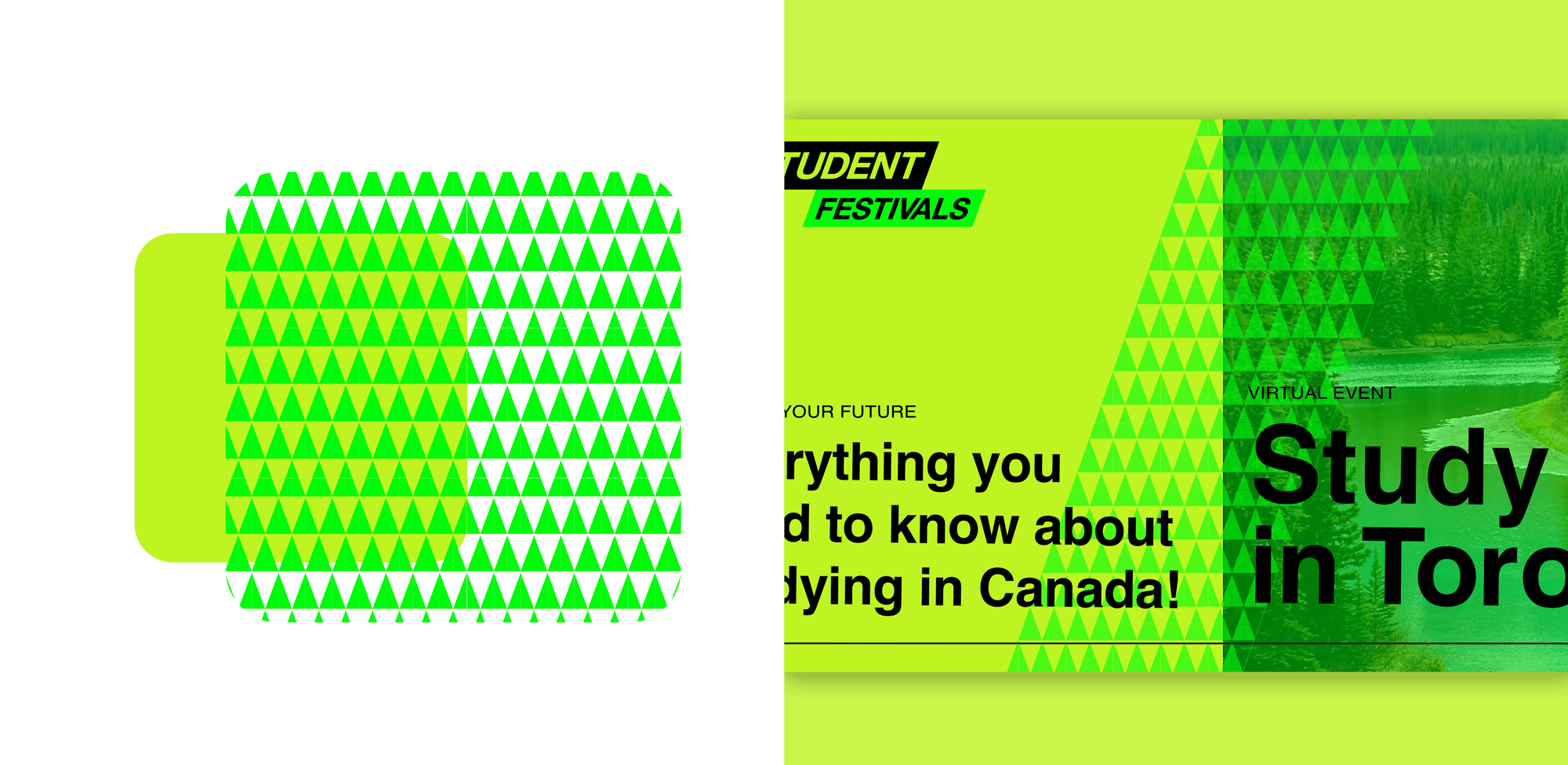
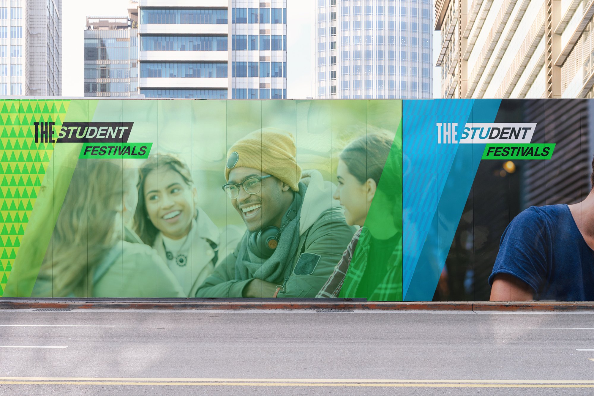
At the core of the system is a series of bespoke patterns, each reflecting the unique character of key study destinations, from Canada’s forests to the UAE’s ornamental motifs. These patterns not only give each region a distinct identity but also ensure brand cohesion across platforms. The system was designed for scalability, seamlessly adapting across digital, social media, and event collateral.
Read below to explore how we brought this identity to life, balancing regional distinction with a unified global presence.
AT A GLANCE
-
The visual system was designed to be bold, dynamic, and high-energy, reflecting the fast-paced nature of Gen Z engagement. A series of region-specific patterns were developed to ensure each area had a distinct identity while remaining part of a unified system. The challenge was to create a "same but different" effect, offering variety without fragmentation.
Inspired by iconic cultural and environmental elements, each pattern was designed to be visually striking, scalable, and instantly recognisable. The use of strong geometric forms, vibrant contrasts, and rhythmic repetition reinforced the festival’s energetic and contemporary aesthetic. The style prioritised versatility and adaptability, allowing seamless integration across social media, event materials, and digital campaigns, ensuring a cohesive brand experience while celebrating local identities.
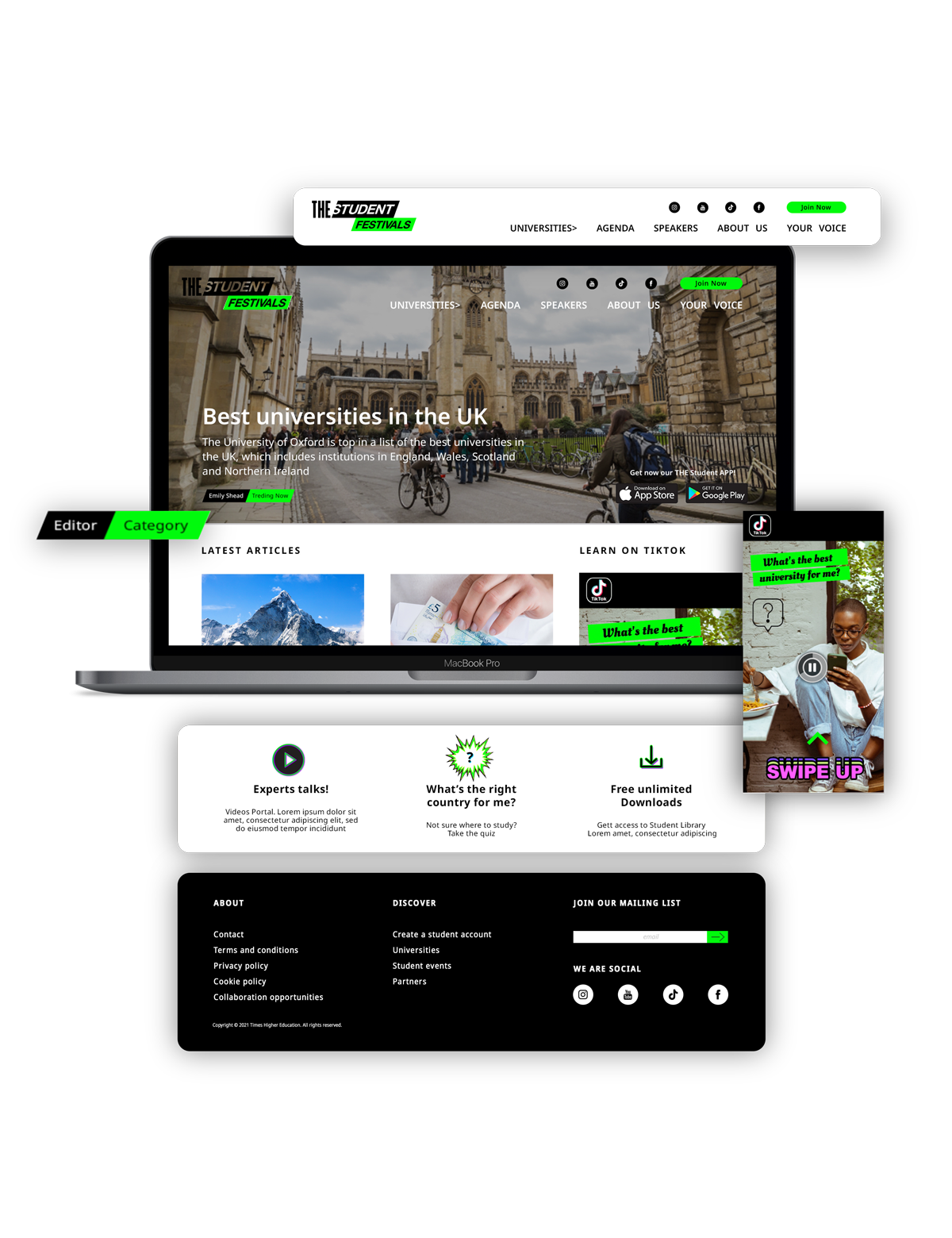
The system extended beyond pattern design, incorporating bold typography, structured layouts, and interactive UI elements to enhance the youth-driven, immersive brand experience. This approach ensured a high-impact visual presence across all platforms, engaging a global student audience with a fresh, modern identity.
-
The development of The Student Festivals brand system required a flexible and scalable approach to engage a global Gen Z audience. Close collaboration with the Head of Design ensured that the identity was both adaptable across regions and visually cohesive.
Pattern System Development - A series of region-specific graphics were designed to differentiate each market while maintaining a unified visual language.
Scalable Identity Design - A structured design system was implemented to ensure consistency across digital, social, and physical applications.
Event & Social Templates - A suite of adaptable templates was developed for Instagram, event collateral, and marketing campaigns, streamlining content creation while reinforcing brand recognition.
Platform UI Design - The identity extended into the platform’s UI, incorporating bold and dynamic visual elements to enhance user experience and engagement.
The final brand system successfully balances regional individuality with a cohesive global presence, creating a visually engaging and adaptable identity. Designed to provide strong brand recognition while allowing for localized expression, the system ensures seamless integration across event branding, social media, and digital platforms. The dynamic and fast-paced aesthetic aligns with Gen Z's visual language, strengthening the platform’s role as a global connector for students. This project highlights how a well-structured design system can unify diverse markets while embracing cultural individuality, resulting in a scalable and immersive brand experience.

-
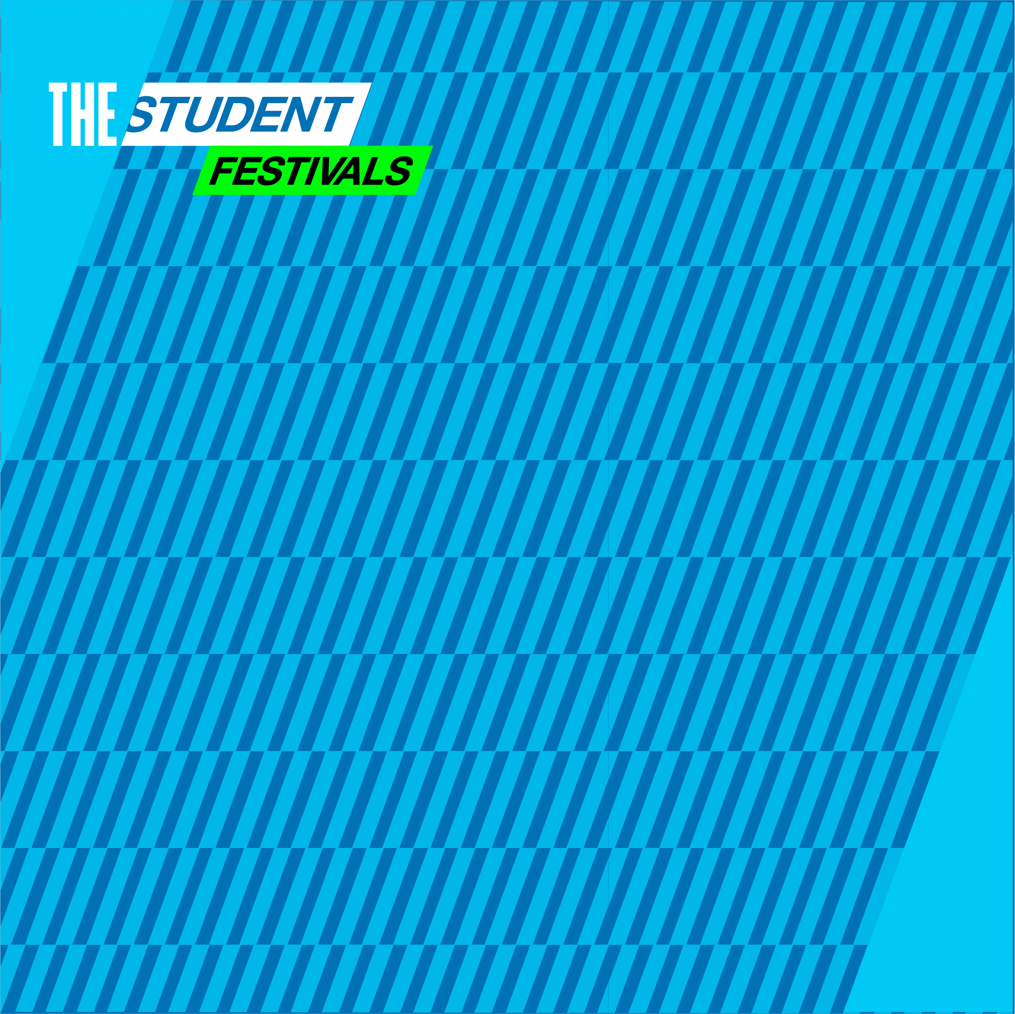
![]()
USA
-
![]()
Australia
-
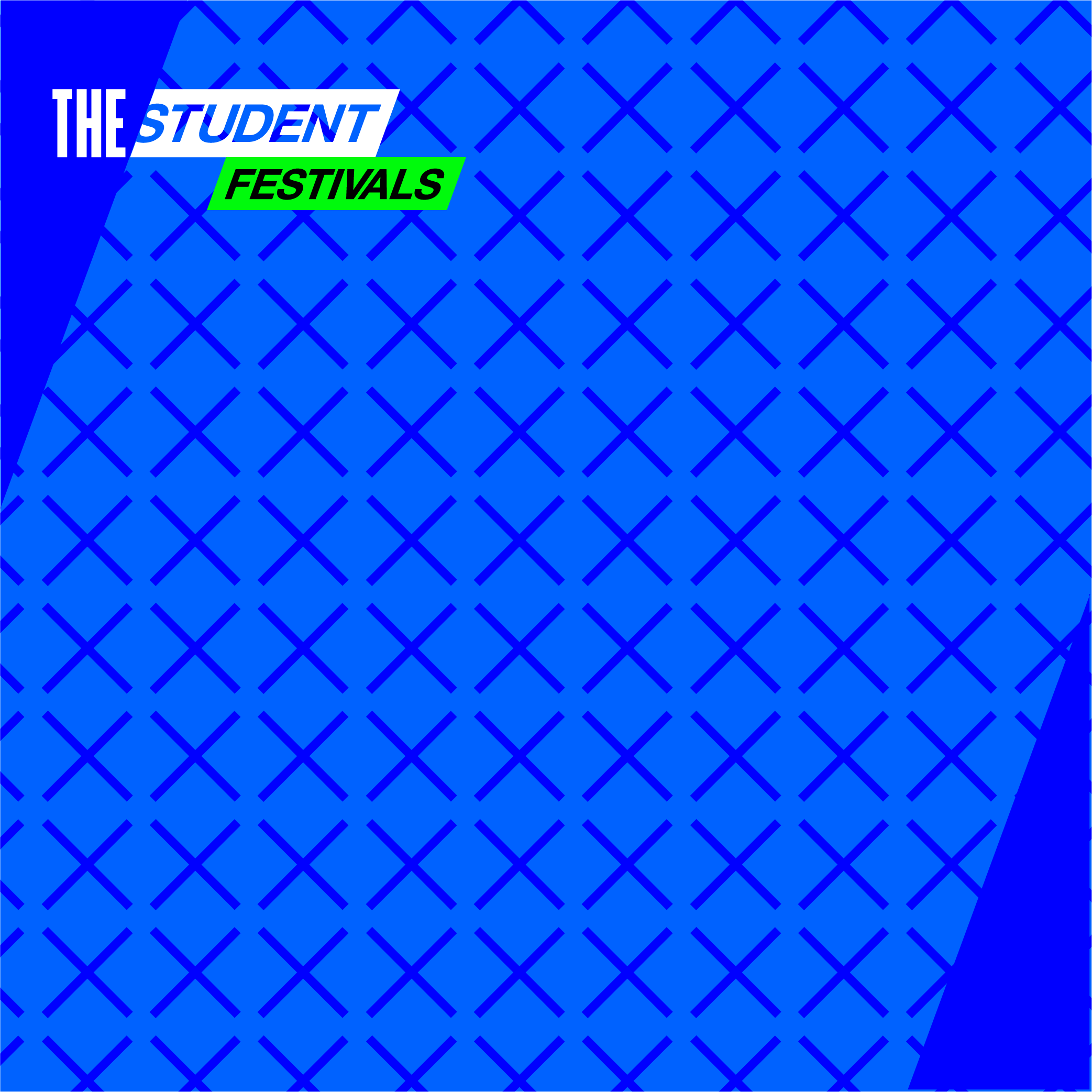
![]()
Europe
-
![]()
UK
-
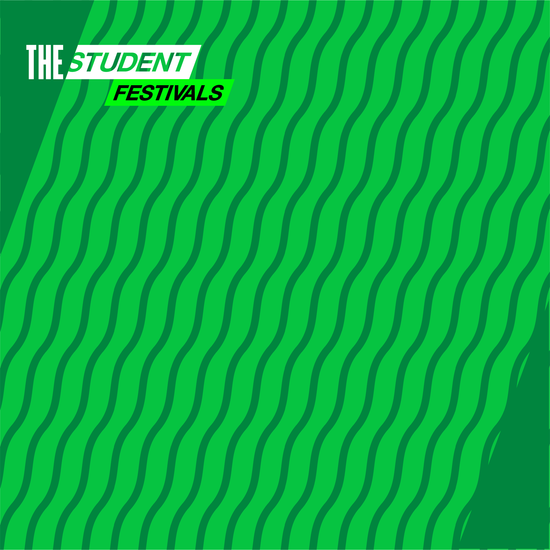
![]()
Canada
-
![]()
UAE
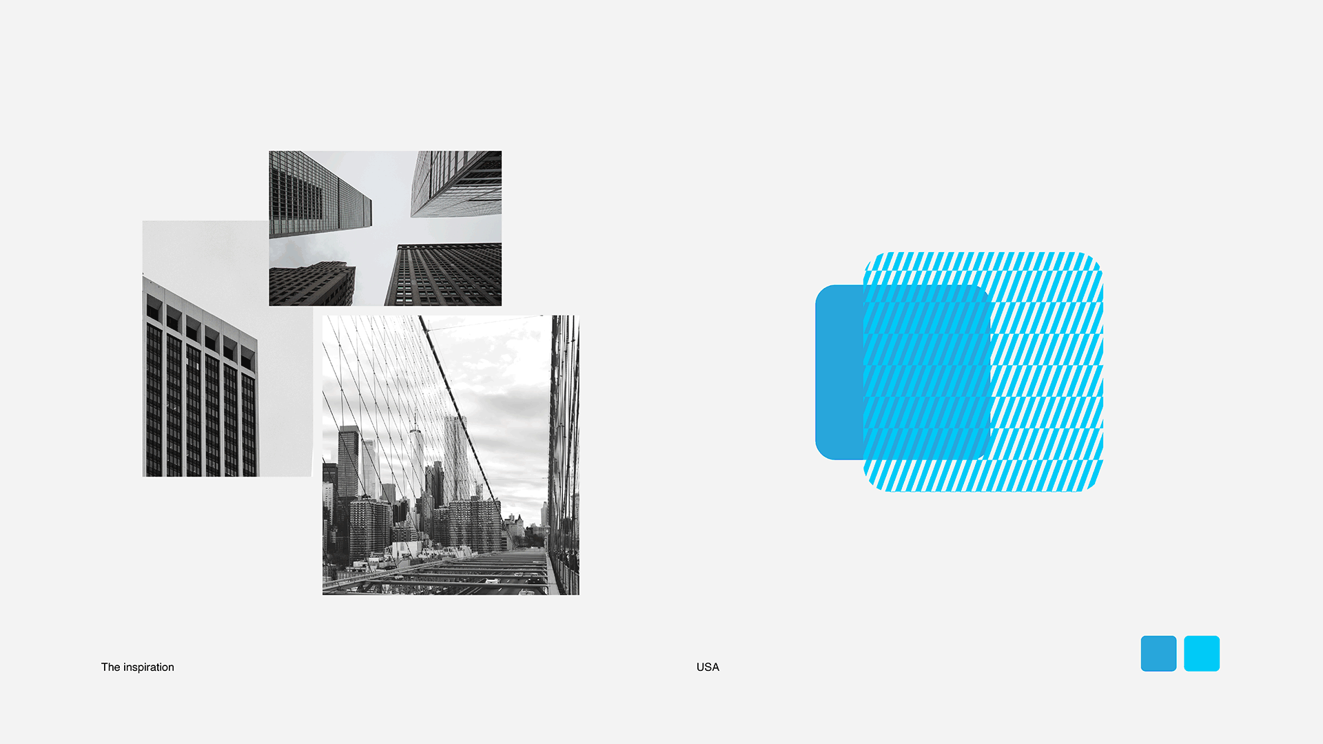
01 | patterns development
THE PROCESS
Creating the regional patterns began with a deep dive into the cultural, environmental, and architectural characteristics unique to each location. The goal was to build a unified visual language that could express local identity while maintaining brand coherence.
We started with research — identifying strong, recognisable motifs rooted in each region’s visual and cultural heritage. From there, we explored abstract interpretations that could carry meaning without being overly literal. The design process included sketching, shape exploration, and multiple iterations to strike the right balance of boldness and clarity.
Each pattern was crafted to be versatile and scalable, performing seamlessly across digital, print, and large-scale environmental formats. Final designs were tested across real-world applications — from social posts to event branding — to ensure consistency and impact at every size.
The final patterns draw inspiration from iconic elements tied to each region:
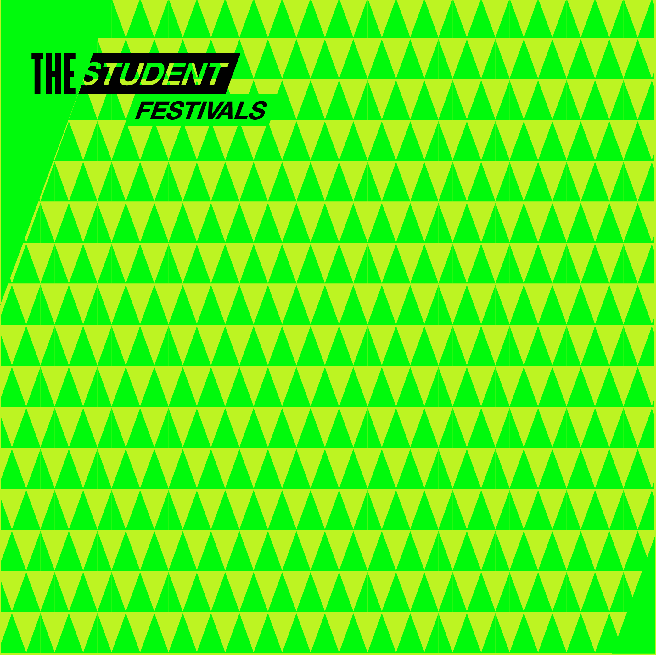
Canada – Tree silhouettes, referencing its expansive forests and evoking a sense of openness and connection to nature
UK – Striped lines influenced by the Abbey Road crosswalk, a subtle nod to British music and pop culture
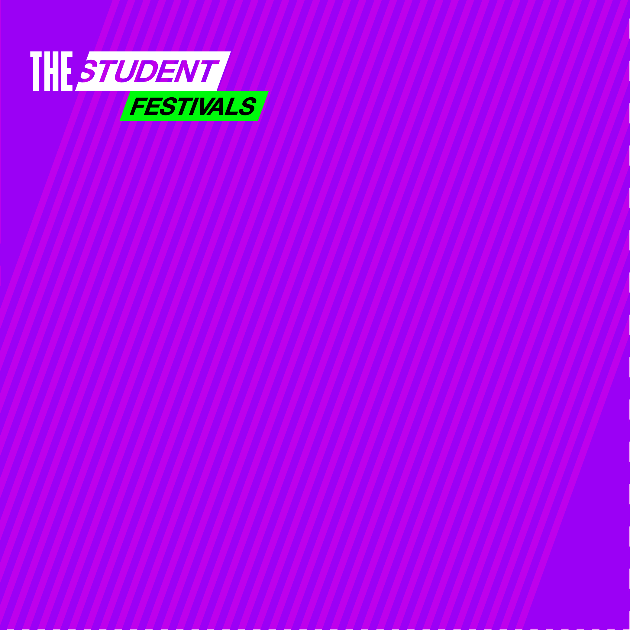
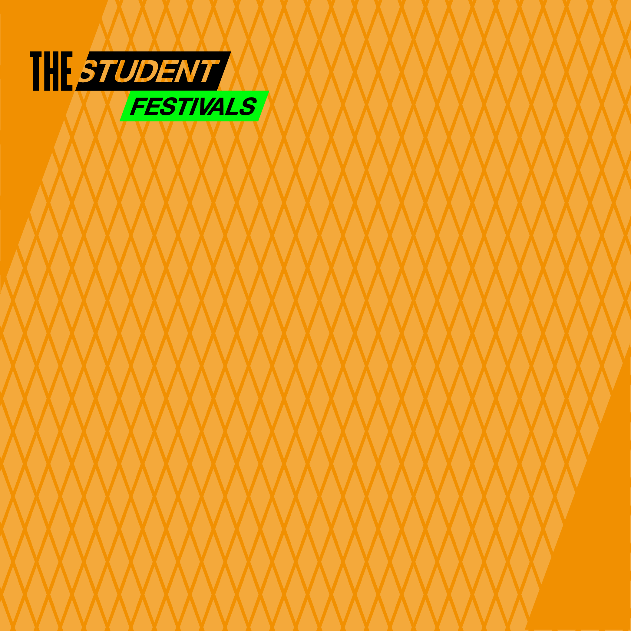
UAE – Geometric forms inspired by traditional Middle Eastern ornamentation, reflecting heritage and architectural intricacy
Australia – Flowing wave motifs, mirroring the country’s coastal landscapes and deep ties to the ocean
USA – Vertical lines echoing the form of skyscrapers, capturing the energy and rhythm of urban life
Europe – A bold ‘X’, symbolising intersection and unity — a convergence of diverse cultures, languages, and histories
Once finalised, these patterns were integrated into the broader brand system, ensuring they remained flexible enough to adapt to various brand touchpoints. By maintaining a consistent visual rhythm and colour palette, the system reinforced a unified brand presence while allowing for individual expression in each region.
Beyond the patterns, the project extended into developing templates for key brand applications, including Instagram assets, event collateral, and digital marketing campaigns. The goal was to create a cohesive, highly adaptable identity that could scale across multiple platforms while staying visually engaging for a Gen Z audience.